Dialog (Modal)
A fully-managed, renderless dialog component jam-packed with accessibility and keyboard features, perfect for building completely custom modal and dialog windows for your next application.
To get started, install Headless UI via npm.
Please note that this library only supports Vue 3.
npm install @headlessui/vue
Dialogs are built using the Dialog, DialogPanel, DialogTitle and DialogDescription
components.
When the dialog's open prop is true, the contents of the dialog will render. Focus will be
moved inside the dialog and trapped there as the user cycles through the focusable elements. Scroll
is locked, the rest of your application UI is hidden from screen readers, and clicking outside the
DialogPanel or pressing the Escape key will fire the close event and close the
dialog.
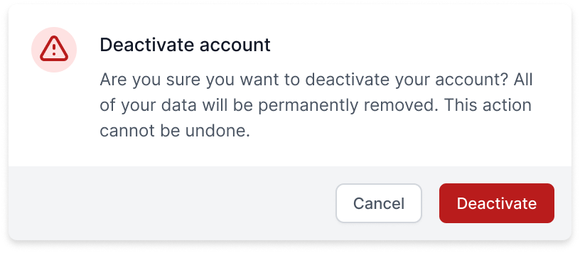
<template>
  <Dialog :open="isOpen" @close="setIsOpen">
    <DialogPanel>
      <DialogTitle>Deactivate account</DialogTitle>
      <DialogDescription>
        This will permanently deactivate your account
      </DialogDescription>

      <p>
        Are you sure you want to deactivate your account? All of your data will be
        permanently removed. This action cannot be undone.
      </p>

      <button @click="setIsOpen(false)">Deactivate</button>
      <button @click="setIsOpen(false)">Cancel</button>
    </DialogPanel>
  </Dialog>
</template>

<script setup>
  import { ref } from 'vue'
  import {
    Dialog,
    DialogPanel,
    DialogTitle,
    DialogDescription,
  } from '@headlessui/vue'

  const isOpen = ref(true)

  function setIsOpen(value) {
    isOpen.value = value
  }
</script>
If your dialog has a title and description, use the DialogTitle and DialogDescription
components to provide the most accessible experience. This will link your title and description
to the root dialog component via the aria-labelledby and aria-describedby attributes, ensuring
their contents are announced to users using screenreaders when your dialog opens.
Dialogs have no automatic management of their open/closed state. To show and hide your dialog,
pass a ref into the open prop. When open is true the dialog will render, and when it's false
the dialog will unmount.
The close event fires when an open dialog is dismissed, which happens when the user clicks
outside your DialogPanel or presses the Escape key. You can use this event to set
open back to false and close your dialog.
<template> <!-- Pass the `isOpen` ref to the `open` prop, and use the `close` event to set the ref back to `false` when the user clicks outside of the dialog or presses the escape key. --><Dialog :open="isOpen" @close="setIsOpen"><DialogPanel> <DialogTitle>Deactivate account</DialogTitle> <DialogDescription> This will permanently deactivate your account </DialogDescription> <p> Are you sure you want to deactivate your account? All of your data will be permanently removed. This action cannot be undone. </p> <!-- You can render additional buttons to dismiss your dialog by setting your `isOpen` state to `false`. --> <button @click="setIsOpen(false)">Cancel</button> <button @click="handleDeactivate">Deactivate</button></DialogPanel></Dialog> </template> <script setup> import { ref } from 'vue' import { Dialog, DialogPanel, DialogTitle, DialogDescription, } from '@headlessui/vue' // The open/closed state lives outside of the Dialog and // is managed by you. const isOpen = ref(true) function setIsOpen(value) {isOpen.value = value} function handleDeactivate() { // ... } </script>
Style the Dialog and DialogPanel components using the class or style props like you would
with any other element. You can also introduce additional elements if needed to achieve a particular
design.
<template>
  <Dialog :open="isOpen" @close="setIsOpen" class="relative z-50">
    <div class="fixed inset-0 flex w-screen items-center justify-center p-4">
      <DialogPanel class="w-full max-w-sm rounded bg-white">
        <DialogTitle>Complete your order</DialogTitle>

        <!-- ... -->
      </DialogPanel>
    </div>
  </Dialog>
</template>

<script setup>
  import { ref } from 'vue'
  import { DialogPanel, DialogTitle, DialogDescription } from '@headlessui/vue'

  const isOpen = ref(true)

  function setIsOpen(value) {
    isOpen.value = value
  }
</script>
Clicking outside the DialogPanel component will close the dialog, so keep that in mind when
deciding which element should receive a given style.
If you'd like to add an overlay or backdrop behind your DialogPanel to bring attention to the
panel itself, we recommend using a dedicated element just for the backdrop and making it a sibling
to your panel container:
<template> <Dialog :open="isOpen" @close="setIsOpen" class="relative z-50"> <!-- The backdrop, rendered as a fixed sibling to the panel container --><div class="fixed inset-0 bg-black/30" aria-hidden="true" /><!-- Full-screen container to center the panel --> <div class="fixed inset-0 flex w-screen items-center justify-center p-4"> <!-- The actual dialog panel --> <DialogPanel class="w-full max-w-sm rounded bg-white"> <DialogTitle>Complete your order</DialogTitle> <!-- ... --> </DialogPanel> </div> </Dialog> </template> <script setup> import { ref } from 'vue' import { Dialog, DialogTitle, DialogDescription } from '@headlessui/vue' const isOpen = ref(true) function setIsOpen(value) { isOpen.value = value } </script>
This lets you transition the backdrop and panel independently with their own animations, and rendering it as a sibling ensures that it doesn't interfere with your ability to scroll long dialogs.
Making a dialog scrollable is handled entirely in CSS, and the specific implementation depends on the design you are trying to achieve.
Here's an example where the entire panel container is scrollable, and the panel itself moves as you scroll:
<template> <Dialog :open="isOpen" @close="setIsOpen" class="relative z-50"> <!-- The backdrop, rendered as a fixed sibling to the panel container --> <div class="fixed inset-0 bg-black/30" aria-hidden="true" /> <!-- Full-screen scrollable container --><div class="fixed inset-0 w-screen overflow-y-auto"><!-- Container to center the panel --><div class="flex min-h-full items-center justify-center p-4"><!-- The actual dialog panel --> <DialogPanel class="w-full max-w-sm rounded bg-white"> <DialogTitle>Complete your order</DialogTitle> <!-- ... --> </DialogPanel> </div> </div> </Dialog> </template> <script setup> import { ref } from 'vue' import { Dialog, DialogTitle, DialogDescription } from '@headlessui/vue' const isOpen = ref(true) function setIsOpen(value) { isOpen.value = value } </script>
When creating a scrollable dialog with a backdrop, make sure the backdrop is rendered behind the scrollable container, otherwise the scroll wheel won't work when hovering over the backdrop, and the backdrop may obscure the scrollbar and prevent users from clicking it with their mouse.
For accessibility reasons, your dialog should contain at least one focusable element. By default,
the Dialog component will focus the first focusable element (by DOM order) once it is rendered,
and pressing the Tab key will cycle through all additional focusable elements within the contents.
Focus is trapped within the dialog as long as it is rendered, so tabbing to the end will start cycling back through the beginning again. All other application elements outside of the dialog will be marked as inert and thus not focusable.
If you'd like something other than the first focusable element to receive initial focus when your
dialog is initially rendered, you can use the initialFocus ref:
<template><Dialog :initialFocus="completeButtonRef" :open="isOpen" @close="setIsOpen"><DialogPanel> <DialogTitle>Complete your order</DialogTitle> <p>Your order is all ready!</p> <button @click="setIsOpen(false)">Deactivate</button> <!-- Use `initialFocus` to force initial focus to a specific ref. --><button ref="completeButtonRef" @click="completeOrder">Complete order </button> </DialogPanel> </Dialog> </template> <script setup> import { ref } from 'vue' import { Dialog, DialogPanel, DialogTitle, DialogDescription, } from '@headlessui/vue'const completeButtonRef = ref(null)const isOpen = ref(true) function setIsOpen(value) { isOpen.value = value } function completeOrder() { // ... } </script>
If you've ever implemented a Dialog before, you've probably come across the concept of Portals. Portals let you invoke components from one place in the DOM (for instance deep within your application UI), but actually render to another place in the DOM entirely.
Since Dialogs and their backdrops take up the full page, you typically want to render them as a sibling to the root-most node of your application. That way you can rely on natural DOM ordering to ensure that their content is rendered on top of your existing application UI. This also makes it easy to apply scroll locking to the rest of your application, as well as ensure that your Dialog's contents and backdrop are unobstructed to receive focus and click events.
Because of these accessibility concerns, Headless UI's Dialog component actually uses a Portal
under-the-hood. This way we can provide features like unobstructed event handling and making the
rest of your application inert. So, when using our Dialog, there's no need to use a Portal yourself!
We've already taken care of it.
To animate the opening/closing of your dialog, wrap it in Headless UI's TransitionRoot component
and remove the open prop from your Dialog, passing your open/closed state to the show prop on
the TransitionRoot instead.
<template> <!-- Wrap your dialog in a `TransitionRoot` to add transitions. --><TransitionRoot:show="isOpen"as="template"enter="duration-300 ease-out"enter-from="opacity-0"enter-to="opacity-100"leave="duration-200 ease-in"leave-from="opacity-100"leave-to="opacity-0"><Dialog @close="setIsOpen"> <DialogPanel> <DialogTitle>Deactivate account</DialogTitle> <!-- ... --> <button @click="isOpen = false">Close</button> </DialogPanel> </Dialog></TransitionRoot></template> <script setup> import { ref } from 'vue' import {TransitionRoot,Dialog, DialogPanel, DialogTitle, } from '@headlessui/vue' const isOpen = ref(true) function setIsOpen(value) { isOpen.value = value } </script>
To animate your backdrop and panel separately, wrap your Dialog with a TransitionRoot and wrap
your backdrop and panel each with their own TransitionChild:
<template> <!-- Wrap your dialog in a `TransitionRoot`. --><TransitionRoot :show="isOpen" as="template"><Dialog @close="setIsOpen"> <!-- Wrap your backdrop in a `TransitionChild`. --><TransitionChildenter="duration-300 ease-out"enter-from="opacity-0"enter-to="opacity-100"leave="duration-200 ease-in"leave-from="opacity-100"leave-to="opacity-0"><div class="fixed inset-0 bg-black/30" /></TransitionChild><!-- Wrap your panel in a `TransitionChild`. --><TransitionChildenter="duration-300 ease-out"enter-from="opacity-0 scale-95"enter-to="opacity-100 scale-100"leave="duration-200 ease-in"leave-from="opacity-100 scale-100"leave-to="opacity-0 scale-95"><DialogPanel> <DialogTitle>Deactivate account</DialogTitle> <!-- ... --> </DialogPanel></TransitionChild></Dialog> </TransitionRoot> </template> <script setup> import { ref } from 'vue' import {TransitionRoot,TransitionChild,Dialog, DialogPanel, DialogTitle, } from '@headlessui/vue' const isOpen = ref(true) function setIsOpen(value) { isOpen.value = value } </script>
To learn more about transitions in Headless UI, read the dedicated Transition documentation.
When the Dialog's open prop is true, the contents of the Dialog will render and focus will be
moved inside the Dialog and trapped there. The first focusable element according to DOM order will
receive focus, although you can use the initialFocus ref to control which element receives
initial focus. Pressing Tab on an open Dialog cycles through all the focusable elements.
When a Dialog is rendered, clicking outside of the DialogPanel will close the Dialog.
No mouse interaction to open the Dialog is included out-of-the-box, though typically you will
wire a <button /> element up with a click handler that toggles the Dialog's open prop to
true.
| Command | Description |
Esc | Closes any open Dialogs |
Tab | Cycles through an open Dialog's contents |
Shift + Tab | Cycles backwards through an open Dialog's contents |
When a Dialog is open, scroll is locked and the rest of your application UI is hidden from screen readers.
All relevant ARIA attributes are automatically managed.
The main Dialog component.
| Prop | Default | Description |
open | — | BooleanWhether the |
initialFocus | — | HTMLElementA ref to an element that should receive focus first. |
as | div | String | ComponentThe element or component the |
static | false | BooleanWhether the element should ignore the internally managed open/closed state. |
unmount | true | BooleanWhether the element should be unmounted or hidden based on the open/closed state. |
| Event | Description |
close | Emitted when the |
| Slot Prop | Description |
open |
Whether or not the dialog is open. |
This indicates the panel of your actual Dialog. Clicking outside of this component will emit the
close event on the Dialog component.
| Prop | Default | Description |
as | div | String | ComponentThe element or component the |
| Render Prop | Description |
open |
Whether or not the dialog is open. |
This is the title for your Dialog. When this is used, it will set the aria-labelledby on the
Dialog.
| Prop | Default | Description |
as | h2 | String | ComponentThe element or component the |
| Slot Prop | Description |
open |
Whether or not the dialog is open. |
This is the description for your Dialog. When this is used, it will set the aria-describedby on
the Dialog.
| Prop | Default | Description |
as | p | String | ComponentThe element or component the |
| Slot Prop | Description |
open |
Whether or not the dialog is open. |
As of Headless UI v1.6, DialogOverlay is deprecated, see the release notes for migration instructions.
| Prop | Default | Description |
as | div | String | ComponentThe element or component the |
| Slot Prop | Description |
open |
Whether or not the dialog is open. |
If you're interested in predesigned component examples using Headless UI and Tailwind CSS, check out Tailwind UI — a collection of beautifully designed and expertly crafted components built by us.
It's a great way to support our work on open-source projects like this and makes it possible for us to improve them and keep them well-maintained.