Radio Group
Radio Groups give you the same functionality as native HTML radio inputs, without any of the styling. They're perfect for building out custom UIs for selectors.
To get started, install Headless UI via npm.
Please note that this library only supports Vue 3.
npm install @headlessui/vue
Radio Groups are built using the RadioGroup, RadioGroupLabel, and RadioGroupOption components.
Clicking an option will select it, and when the Radio Group is focused, the arrow keys will change the selected option.
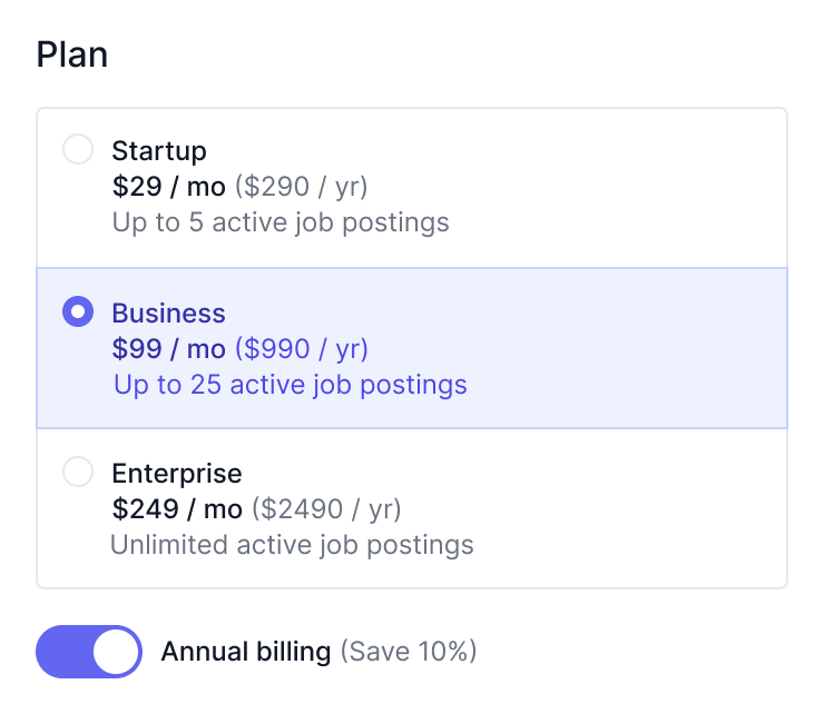
<template>
  <RadioGroup v-model="plan">
    <RadioGroupLabel>Plan</RadioGroupLabel>
    <RadioGroupOption v-slot="{ checked }" value="startup">
      <span :class="checked ? 'bg-blue-200' : ''">Startup</span>
    </RadioGroupOption>
    <RadioGroupOption v-slot="{ checked }" value="business">
      <span :class="checked ? 'bg-blue-200' : ''">Business</span>
    </RadioGroupOption>
    <RadioGroupOption v-slot="{ checked }" value="enterprise">
      <span :class="checked ? 'bg-blue-200' : ''">Enterprise</span>
    </RadioGroupOption>
  </RadioGroup>
</template>

<script setup>
  import { ref } from 'vue'
  import {
    RadioGroup,
    RadioGroupLabel,
    RadioGroupOption,
  } from '@headlessui/vue'

  const plan = ref('startup')
</script>
Headless UI keeps track of a lot of state about each component, like which radiogroup option is currently selected, whether a popover is open or closed, or which item in a radiogroup is currently active via the keyboard.
But because the components are headless and completely unstyled out of the box, you can't see this information in your UI until you provide the styles you want for each state yourself.
Each component exposes information about its current state via slot props that you can use to conditionally apply different styles or render different content.
For example, the RadioGroupOption component exposes an active state, which tells you if the item is currently focused via the mouse or keyboard.
<template> <RadioGroup v-model="plan"> <RadioGroupLabel>Plan</RadioGroupLabel> <!-- Use the `active` state to conditionally style the active option. --> <!-- Use the `checked` state to conditionally style the checked option. --> <RadioGroupOption v-for="plan in plans" :key="plan" :value="plan" as="template"v-slot="{ active, checked }"> <li :class="{'bg-blue-500 text-white': active,'bg-white text-black': !active,}" ><CheckIcon v-show="checked" />{{ plan }} </li> </RadioGroupOption> </RadioGroup> </template> <script setup> import { ref } from 'vue' import { RadioGroup, RadioGroupLabel, RadioGroupOption, } from '@headlessui/vue' import { CheckIcon } from '@heroicons/vue/20/solid' const plans = ['Startup', 'Business', 'Enterprise'] const plan = ref(plans[0]) </script>
For a complete list of all the available slot props, see the component API documentation.
Each component also exposes information about its current state via a data-headlessui-state attribute that you can use to conditionally apply different styles.
When any of the states in the slot prop API are true, they will be listed in this attribute as space-separated strings so you can target them with a CSS attribute selector in the form [attr~=value].
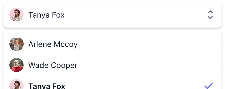
For example, here's what the RadioGroup component with some child RadioGroupOption components renders when the radiogroup is open and the second item is active:
<!-- Rendered `RadioGroup` -->
<ul data-headlessui-state="open">
  <li data-headlessui-state="">Wade Cooper</li>
  <li data-headlessui-state="active selected">Arlene Mccoy</li>
  <li data-headlessui-state="">Devon Webb</li>
</ul>
If you are using Tailwind CSS, you can use the @headlessui/tailwindcss plugin to target this attribute with modifiers like ui-open:* and ui-active:*:
<template> <RadioGroup v-model="plan"> <RadioGroupLabel>Plan</RadioGroupLabel> <RadioGroupOption v-for="plan in plans" :key="plan" :value="plan" as="template" > <liclass="ui-active:bg-blue-500 ui-active:text-white ui-not-active:bg-white ui-not-active:text-black"><CheckIcon class="hidden ui-checked:block" />{{ plan }} </li> </RadioGroupOption> </RadioGroup> </template> <script setup> import { ref } from 'vue' import { RadioGroup, RadioGroupLabel, RadioGroupOption, } from '@headlessui/vue' import { CheckIcon } from '@heroicons/vue/20/solid' const plans = ['Startup', 'Business', 'Enterprise'] const plan = ref(plans[0]) </script>
Unlike native HTML form controls which only allow you to provide strings as values, Headless UI supports binding complex objects as well.
<template><RadioGroup v-model="plan"><RadioGroupLabel>Plan</RadioGroupLabel><RadioGroupOption v-for="plan in plans" :key="plan.id" :value="plan">{{ plan.name }} </RadioGroupOption> </RadioGroup> </template> <script setup> import { ref } from 'vue' import { RadioGroup, RadioGroupLabel, RadioGroupOption, } from '@headlessui/vue'const plans = [{ id: 1, name: 'Startup' },{ id: 2, name: 'Business' },{ id: 3, name: 'Enterprise' },]const plan = ref(plans[1]) </script>
When binding objects as values, it's important to make sure that you use the same instance of the object as both the value of the RadioGroup as well as the corresponding RadioGroupOption, otherwise they will fail to be equal and cause the radiogroup to behave incorrectly.
To make it easier to work with different instances of the same object, you can use the by prop to compare the objects by a particular field instead of comparing object identity:
<template> <RadioGroup :modelValue="modelValue" @update:modelValue="value => emit('update:modelValue', value)"by="id"> <RadioGroupLabel>Assignee</RadioGroupLabel> <RadioGroupOption v-for="plan in plans" :key="plan.id" :value="plan"> {{ plan.name }} </RadioGroupOption> </RadioGroup> </template> <script setup> import { RadioGroup, RadioGroupLabel, RadioGroupOption, } from '@headlessui/vue' const props = defineProps({ modelValue: Object }) const emit = defineEmits(['update:modelValue']) const plans = [ { id: 1, name: 'Startup' }, { id: 2, name: 'Business' }, { id: 3, name: 'Enterprise' }, ] </script>
You can also pass your own comparison function to the by prop if you'd like complete control over how objects are compared:
<template> <RadioGroup :modelValue="modelValue" @update:modelValue="value => emit('update:modelValue', value)":by="comparePlans"> <RadioGroupLabel>Assignee</RadioGroupLabel> <RadioGroupOption v-for="plan in plans" :key="plan.id" :value="plan"> {{ plan.name }} </RadioGroupOption> </RadioGroup> </template> <script setup> import { RadioGroup, RadioGroupLabel, RadioGroupOption, } from '@headlessui/vue' const props = defineProps({ modelValue: Object }) const emit = defineEmits(['update:modelValue'])function comparePlans(a, b) {return a.name.toLowerCase() === b.name.toLowerCase()}const plans = [ { id: 1, name: 'Startup' }, { id: 2, name: 'Business' }, { id: 3, name: 'Enterprise' }, ] </script>
If you add the name prop to your listbox, hidden input elements will be rendered and kept in sync with your selected value.
<template> <form action="/billing" method="post"><RadioGroup v-model="plan" name="plan"><RadioGroupLabel>Plan</RadioGroupLabel> <RadioGroupOption v-for="plan in plans" :key="plan" :value="plan"> {{ plan }} </RadioGroupOption> </RadioGroup> <button>Submit</button> </form> </template> <script setup> import { ref } from 'vue' import { RadioGroup, RadioGroupLabel, RadioGroupOption, } from '@headlessui/vue' const plans = ['startup', 'business', 'enterprise'] const plan = ref(plans[0]) </script>
This lets you use a radio group inside a native HTML <form> and make traditional form submissions as if your radio group was a native HTML form control.
Basic values like strings will be rendered as a single hidden input containing that value, but complex values like objects will be encoded into multiple inputs using a square bracket notation for the names.
<input type="hidden" name="plan" value="startup" />
If you provide a defaultValue prop to the RadioGroup instead of a value, Headless UI will track its state internally for you, allowing you to use it as an uncontrolled component.
<template> <form action="/billing" method="post"><RadioGroup name="plan" :defaultValue="plans[0]"><RadioGroupLabel>Plan</RadioGroupLabel> <RadioGroupOption v-for="plan in plans" :key="plan" :value="plan"> {{ plan }} </RadioGroupOption> </RadioGroup> <button>Submit</button> </form> </template> <script setup> import { RadioGroup, RadioGroupLabel, RadioGroupOption, } from '@headlessui/vue' const plans = ['startup', 'business', 'enterprise'] </script>
This can simplify your code when using the combobox with HTML forms or with form APIs that collect their state using FormData instead of tracking it using React state.
Any @update:modelValue prop you provide will still be called when the component's value changes in case you need to run any side effects, but you won't need to use it to track the component's state yourself.
You can use the RadioGroupLabel and RadioGroupDescription components to mark up each option's contents. Doing so will automatically link each component to its ancestor RadioGroupOption component via the aria-labelledby and aria-describedby attributes and autogenerated ids, improving the semantics and accessibility of your custom selector.
By default, RatioGroupLabel renders a label element and RadioGroupDescription renders a <div>. These can also be customized using the as prop, as described in the API docs below.
Note also that Labels and Descriptions can be nested. Each one will refer to its nearest ancestor component, whether than ancestor is a RadioGroupOption or the root RadioGroup itself.
<template> <RadioGroup v-model="plan"> <!-- This label is for the root `RadioGroup` --><RadioGroupLabel class="sr-only">Plan</RadioGroupLabel><div class="rounded-md bg-white"> <RadioGroupOption value="startup" as="template" v-slot="{ checked }"> <div :class='checked ? "bg-indigo-50 border-indigo-200" : "border-gray-200"' class="relative flex border p-4" > <div class="flex flex-col"> <!-- This label is for the `RadioGroupOption` --><RadioGroupLabel as="template"><span:class='checked ? "text-indigo-900" : "text-gray-900"'class="block text-sm font-medium">Startup</span></RadioGroupLabel><!-- This description is for the `RadioGroupOption` --><RadioGroupDescription as="template"><span:class='checked ? "text-indigo-700" : "text-gray-500"'class="block text-sm">Up to 5 active job postings</span></RadioGroupDescription></div> </div> </RadioGroupOption> </div> </RadioGroup> </template> <script setup> import { ref } from 'vue' import { RadioGroup, RadioGroupLabel, RadioGroupOption, RadioGroupDescription, } from '@headlessui/vue' const plan = ref('startup') </script>
Clicking a RadioGroupOption will select it.
All interactions apply when a RadioGroup component is focused.
| Command | Description |
ArrowDown or ArrowUp or ArrowLeft or ArrowRight | Cycles through a RadioGroup's options |
Space when no option is selected yet | Selects the first option |
Enter when in a form | Submits the form |
| Prop | Default | Description |
as | div | String | ComponentThe element or component the |
v-model | — | TThe selected value. |
defaultValue | — | TThe default value when using as an uncontrolled component. |
by | — | keyof T | ((a: T, z: T) => boolean)Use this to compare objects by a particular field, or pass your own comparison function for complete control over how objects are compared. |
disabled | false | booleanWhether or not the |
| Prop | Default | Description |
as | div | String | ComponentThe element or component the |
value | — | T | undefinedThe value of the current |
disabled | false | booleanWhether or not the |
name | — | StringThe name used when using this component inside a form. |
| Slot Prop | Description |
active |
Whether or not the option is active (using the mouse or keyboard). |
checked |
Whether or not the current option is the checked value. |
disabled |
Whether or not the current option is disabled. |
Renders an element whose id attribute is automatically generated, and is then linked to its nearest ancestor RadioGroup or RadioGroupOption component via the aria-labelledby attribute.
| Prop | Default | Description |
as | label | String | ComponentThe element or component the |
Renders an element whose id attribute is automatically generated, and is then linked to its nearest ancestor RadioGroup or RadioGroupOption component via the aria-describedby attribute.
| Prop | Default | Description |
as | div | String | ComponentThe element or component the |
If you're interested in predesigned component examples using Headless UI and Tailwind CSS, check out Tailwind UI — a collection of beautifully designed and expertly crafted components built by us.
It's a great way to support our work on open-source projects like this and makes it possible for us to improve them and keep them well-maintained.